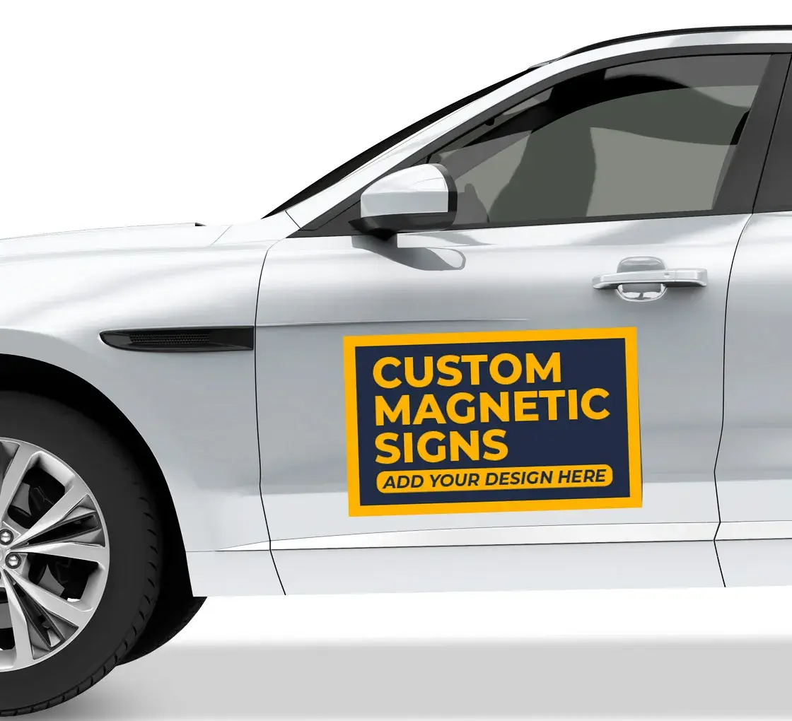
You’ve probably seen dozens of car magnets in traffic and forgotten most of them within seconds. Then once in a while, one actually sticks in your mind. That’s not luck. That’s design done right.
Businesses investing in reflective car magnet printing in Los Angeles often assume the reflective surface alone will do the job. It helps, sure. But visibility and memorability come from smart design choices layered on top of that shine. If you want people to notice your magnet at a red light – and remember it later – you need more than just your logo slapped on a rectangle.
Let’s break down what actually works.
Start with Contrast That Hits Instantly
Reflective material catches light, but contrast catches attention.
When using a reflective vinyl magnet, think bold color pairings. Dark navy with white. Black with bright yellow. Deep red with crisp lettering. Subtle gradients might look elegant on a laptop screen, but on a moving car? They disappear.
Drivers have maybe three seconds to read your message. High contrast ensures your text doesn’t blur into the background – especially at night when headlights bounce off the surface.
If you’re exploring reflective car magnet printing in Los Angeles, test your design by shrinking it down on your screen. If you can’t read it instantly, neither can anyone else on the road.
Keep the Message Short (Really Short)
This is where most designs fail. People try to fit everything: tagline, services, phone number, Instagram, website, QR code. It turns into a moving billboard no one finishes reading.
Instead, focus on:
- Business name
- One clear service
- One easy contact detail
That’s it.
Good reflective vehicle magnets don’t overload information. They prioritize clarity over completeness. You’re not writing a brochure – you’re planting a memory.
Typography Makes or Breaks It
Script fonts might look stylish, but if they require effort to read, they’re working against you.
Stick to clean, thick fonts with strong spacing. Letters should breathe. Avoid cramming text too close to the edges. When designing for reflective car magnet printing in Los Angeles, remember that motion distorts fine details. Thin strokes and decorative fonts fade quickly in real-world conditions.
A practical rule? If someone driving beside you can read it without squinting, you’re on the right track.
Size and Placement Matter More Than You Think
Even the best design fails if it’s too small.
Car magnets need enough surface area to stand out from the body color of the vehicle. A tiny magnet on a large truck just looks accidental. On the other hand, an oversized design without balance can look cluttered.
Before finalizing your layout for reflective car magnet printing in Los Angeles, think about where it will sit:
- Side doors get the most exposure
- Rear panels work well in traffic
- Avoid curved areas that distort the magnet
Flat placement keeps edges clean and professional-looking.
Use White Space Strategically
White space isn’t wasted space. It guides the eye.
A crowded layout competes with itself. Clean spacing around your logo and text creates breathing room. The reflective surface already adds visual energy – you don’t need extra graphics fighting for attention.
When done well, reflective car magnet printing in Los Angeles designs look intentional, not noisy. Simple layouts often outperform complicated ones because they feel confident.
Think About Night Visibility
This is where reflective material really shines – literally.
But not all reflective finishes behave the same way. A quality reflective vinyl magnet enhances visibility when headlights hit it. However, the design should still be legible without glare washing out the text.
Avoid overly glossy backgrounds that overpower lettering at night. Test your design concept against both light and dark vehicle colors. A magnet that looks great on a white van might lose impact on a black SUV.
Durability Is Part of the Design
This often gets ignored. A peeling or fading magnet damages perception faster than no magnet at all.
If you’re considering reflective car magnet printing in Los Angeles, choose materials that resist weather, heat, and frequent removal. Clean edges and strong adhesion make the design look polished over time.
Even the smartest typography can’t save a magnet that curls at the corners.
Don’t Copy Billboard Logic
Car magnets aren’t billboards. They’re mobile, closer to eye level, and seen at varying distances.
That means scaling matters differently. Small text that might work on a large roadside board won’t translate here. Likewise, overly complex graphics reduce clarity.
Well-designed reflective vehicle magnets respect movement. They communicate fast and leave a clean visual imprint.
Test Before You Print
Before finalizing your file for reflective car magnet printing in Los Angeles, print a scaled version on regular paper. Tape it to a wall. Step back 10–15 feet. Can you read it clearly? Does anything feel crowded?
Better yet, preview it against a photo of your vehicle color. Context changes everything.
In short
When thoughtfully executed, reflective car magnet printing in Los Angeles can turn an ordinary vehicle into a moving introduction. Not loud. Not pushy. Just visible, sharp, and easy to remember.
And that’s the real goal.